
 Today I would like to delve into the visual style of the game, and how it is attempting to convey its world through its art style and aesthetics. But first, let me take a small detour to talk a bit about game aesthetics in general and particularly the surge of retro-inspired art styles that have been emerging for a while now.
Retro Aesthetics In Games
Needless to say, there have been a great many games with aesthetics that would be described as “pixely”, “low-res”, “old-school”, “retro” and so on. What’s important to highlight here is that these visual styles emerged largely by necessity – due to technical limitations during the 80s and 90s, resolutions and color ranges had to be kept low. Artists were thus forced to work within very tight constraints – but even though the original premise was one of limitations, the emerging art often turned out evocative in its own right. This is an important point, since it is [i]this[/i] that successful modern retro aesthetics attempt to emulate. When an old school-inspired game is rather approached with the mindset of “It should be pixely since older games are pixely” it often leads to far worse results – it’s important to ask [i]why[/i] you would want this sort of aesthetic. Simply wanting a game to emulate the style of its source of inspiration isn’t inherently bad, but it helps to understand why this aesthetic is interesting and engaging in the first place. And why is this exactly? In most cases it comes down to [i]abstraction[/i] – it’s the same reason you might value a Picasso for what it evokes rather than for being as close to photorealism as possible. At the very extreme on this spectrum we have things like ASCII games – something like [i]Dwarf Fortress[/i] is evocative because it’s so minimalist that you paint your own picture of its world. In fact I wrote a short article on this topic here: https://medium.com/@ivarhill/the-two-pixel-fish-odd-realm-and-the-beauty-of-inspirational-pixel-art-da3e748456fc But higher-fidelity art styles can also have the same intent. Pixel art in general is a good example, but also aesthetics within 3D space. A game such as Quake is still incredibly atmospheric today for this very reason. It is also why one may consider a game such as Minecraft to be visually appealing – not despite its simplicity but because of it.The Way We Remember
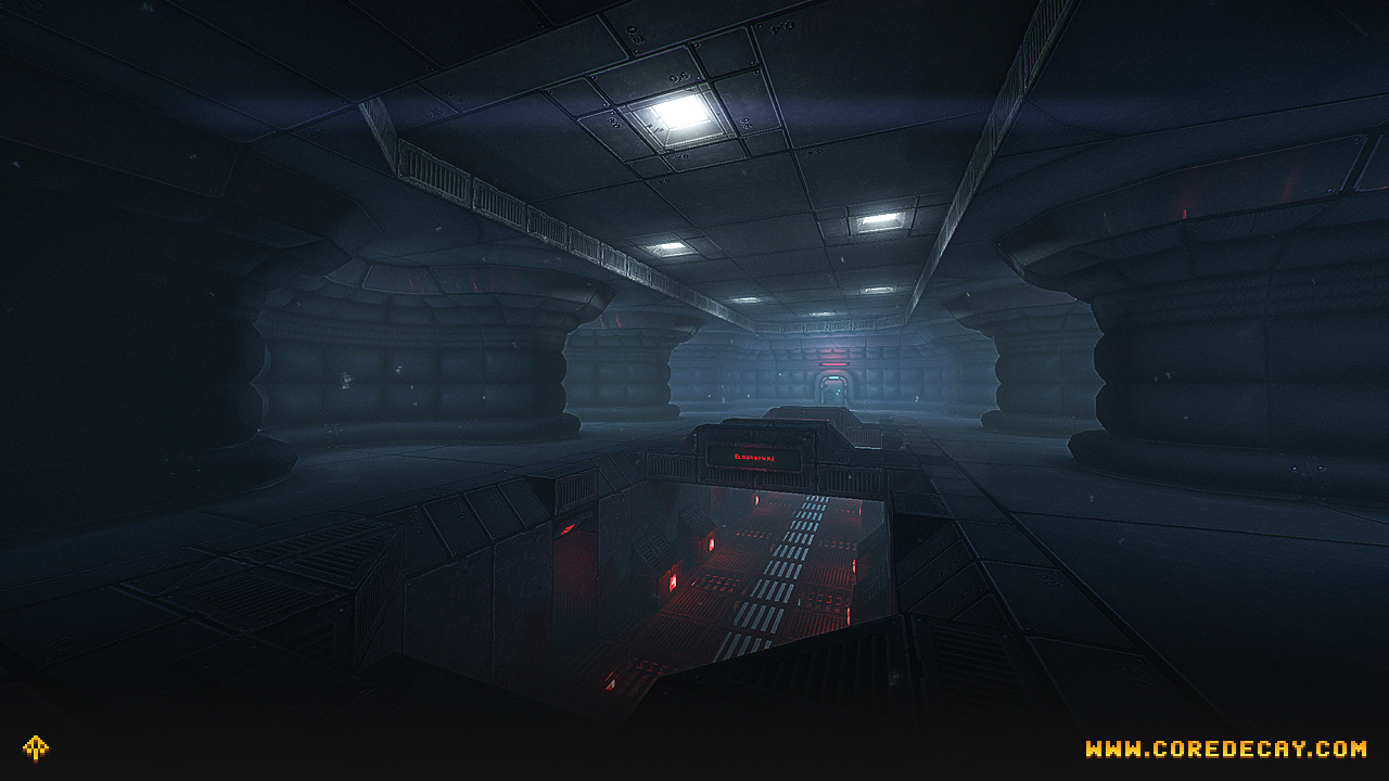
So how does this translate to Core Decay? In short, there are two main goals of the game’s art direction. One is derivative – it’s intended to evoke the way we remember old-school games to look, more so than the way they [i]actually[/i] looked at the time. Two strong sources of inspiration here are [i]Descent[/i] and [i]Unreal 1,[/i] both with point filtered low resolution textures and atmospheric lighting. Core Decay reimagines this approach for a modern game, with more abstract textures that still feature modern rendering and lighting techniques.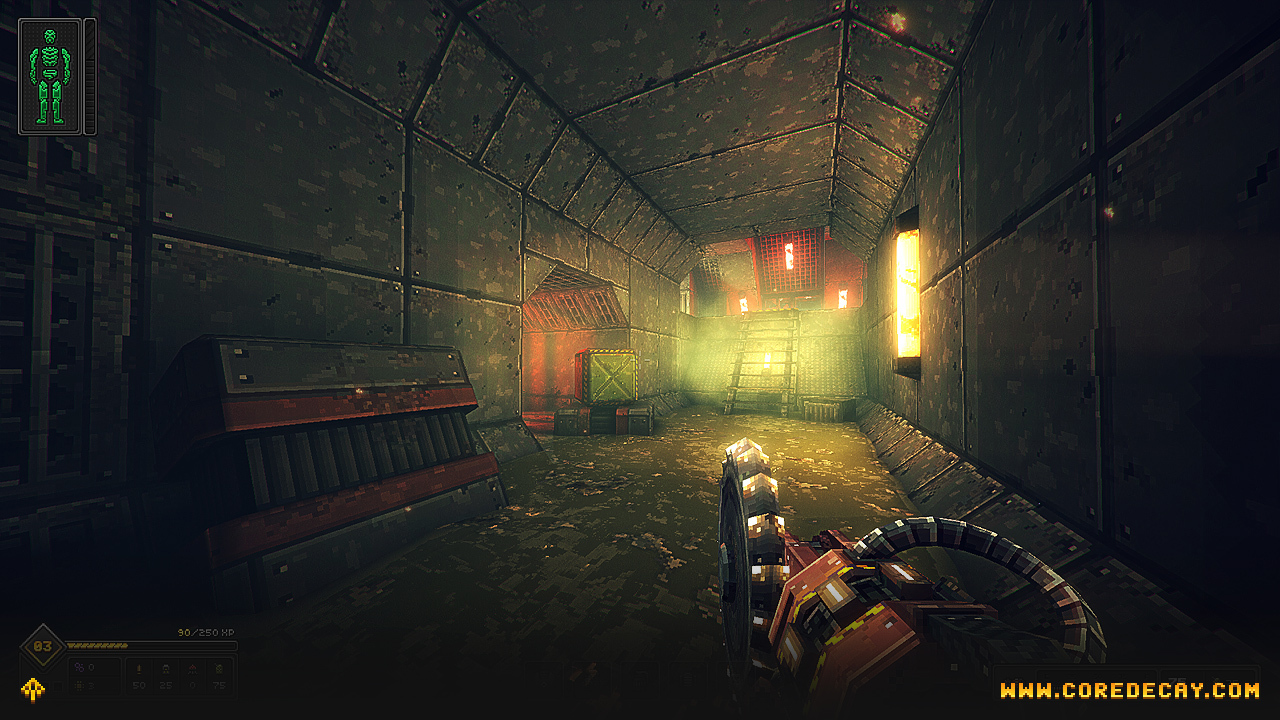 The second goal is to be beautiful and immersive in its [i]own[/i] right, regardless of what other games may have come before. Its combination of low-resolution art and modern rendering techniques is intended to look atmospheric and evocative – sometimes that’s all the justification you need! It may also come as a surprise that the game actually features things such as real-time reflections – but they are all in service to the overall aesthetic rather than simply added as an afterthought.
On the flip side, one thing I wanted to avoid – and thus is not present in the game – is specular and normal maps. I feel that this takes away from the textures as an abstract representation and makes them feel more like a physical material, which clashes with the overall art style.
The second goal is to be beautiful and immersive in its [i]own[/i] right, regardless of what other games may have come before. Its combination of low-resolution art and modern rendering techniques is intended to look atmospheric and evocative – sometimes that’s all the justification you need! It may also come as a surprise that the game actually features things such as real-time reflections – but they are all in service to the overall aesthetic rather than simply added as an afterthought.
On the flip side, one thing I wanted to avoid – and thus is not present in the game – is specular and normal maps. I feel that this takes away from the textures as an abstract representation and makes them feel more like a physical material, which clashes with the overall art style.
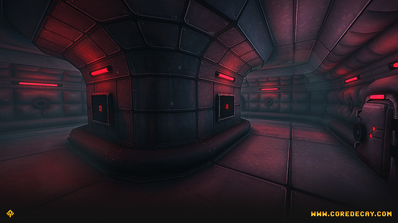 [i]Real-time reflections are cast on these shiny metal walls – however, said reflections are still point-filtered and low-res, blending in perfectly with the overall style. [/i]
Of course, all of this is a lot of words to simply say “The art style of Core Decay looks the way it does in order to look good”, which is obviously a bit of a meaningless statement to make. But the bottom line here is that every aspect of the aesthetic is deliberate and serves the visual identity of [i]this[/i] game – it is not arbitrarily put in place to meet any sort of “retro-looking” criteria or to emulate the style of any one specific game that came before it.
[i]Real-time reflections are cast on these shiny metal walls – however, said reflections are still point-filtered and low-res, blending in perfectly with the overall style. [/i]
Of course, all of this is a lot of words to simply say “The art style of Core Decay looks the way it does in order to look good”, which is obviously a bit of a meaningless statement to make. But the bottom line here is that every aspect of the aesthetic is deliberate and serves the visual identity of [i]this[/i] game – it is not arbitrarily put in place to meet any sort of “retro-looking” criteria or to emulate the style of any one specific game that came before it.
Aesthetic Through Worldbuilding
There is far more to an art style than technical components, however! Equally critical is how the world itself is designed. Looking at a classic such as, say, [i]Blade Runner,[/i] you cannot really separate the world from the aesthetics, the writing from the visuals. It’s all one coherent whole which feels unified in theme – and this holds equally true for games. As discussed in the last dev blog entry, on both a gameplay level and a visual level Core Decay is heavily rooted in verisimilitude – and this is also reflected in its art. This is easier expressed as a set of rules:- Where does an object come from? Is it created by a known organization or corporation? Its design should reflect this.
- Anything that is present should make logical sense. If a part rotates, lifts or moves, it should be obvious how this actually happens. If it emits light, the actual light source should be obvious. And so on. This doesn’t mean every little detail has to be completely accounted for, but the overall design should make sense.
- Functionality is more important than coolness factor. If something looks badass, that’s awesome, but there should be a reason for its visual design within the game world.
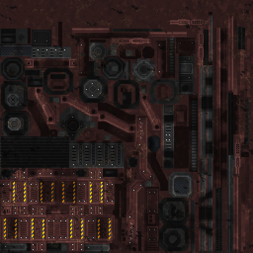
- The world is grim, but not devoid of color. Color schemes and saturation exist where it is logical, such as bright displays, coolant pipes in vivid colors, corporate logos and so on. Other, more mundane objects may look appropriately dull and desaturated by comparison.
Dissecting A Core Decay Asset
So far all this has been a pretty abstract, high-level look at the art style of the game. Let’s more concretely look at an asset from the game, namely the [i]Minelayer[/i] weapon which fires proximity mines. The Proximity Mine is a very versatile tool in the player’s arsenal – it can be directly attached to walls and other surfaces without the need for a weapon at all, but when used together with the Minelayer it becomes particularly powerful. Fired at great distances, the player can set up traps from a safe location – or even fire the mines directly at an enemy upon which the weapon acts more as a grenade launcher! Furthermore, many different kinds of mines exist at the player’s disposal – Frag Mines deal direct damage, Gas Mines cause non-lethal damage over time, and EMP Mines disable robotics. For the actual Minelayer weapon, it needed to look utilitarian – not necessarily designed for military applications but closer to an industrial tool. Usually these assets are preceded by concept art, but in this case the weapon was created while Core Decay was still a solo project of mine so I went right into modelling as a means of blocking out various approaches. What I eventually ended up with was this: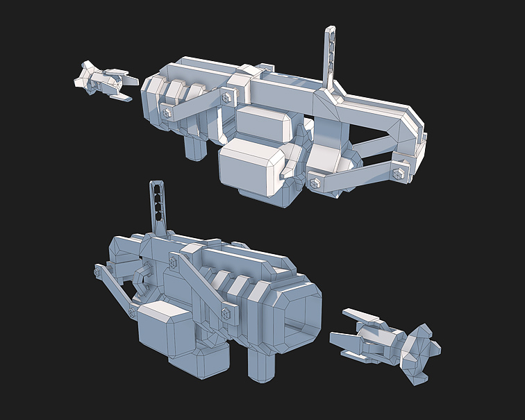 There are a few things to note here. The overall approach to Core Decay models is to only add something into the actual mesh if it contributes to the object’s silhouette – anything else can be detailed up in the actual texture.
The actual design of the weapon also embodies the design philosophies mentioned above. All the mechanisms of its operation are in plain sight to the player – the mine canisters, the mechanism for revolving the magazine and inserting the canisters into the barrel, and so on.
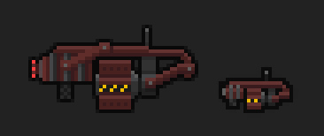
Once the model itself is completed, the next step is texturing. In the case of the Minelayer, the final texture looks like this:
There are a few things to note here. The overall approach to Core Decay models is to only add something into the actual mesh if it contributes to the object’s silhouette – anything else can be detailed up in the actual texture.
The actual design of the weapon also embodies the design philosophies mentioned above. All the mechanisms of its operation are in plain sight to the player – the mine canisters, the mechanism for revolving the magazine and inserting the canisters into the barrel, and so on.
Once the model itself is completed, the next step is texturing. In the case of the Minelayer, the final texture looks like this:
 Note that this has been blown up by a factor of 2x for demonstration purposes – the actual texture is 256×256 pixels and any visible pixelation is solely a result of point filtering on the actual model.
The texture itself is hand-painted pixel by pixel, and also has lighting baked into it for further detail. Applied to the model, the final result looks like this:
Note that this has been blown up by a factor of 2x for demonstration purposes – the actual texture is 256×256 pixels and any visible pixelation is solely a result of point filtering on the actual model.
The texture itself is hand-painted pixel by pixel, and also has lighting baked into it for further detail. Applied to the model, the final result looks like this:
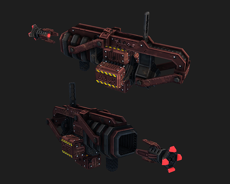 As you can see, the texture adds a huge amount of detail to this asset – and one crucial aspect of Core Decay texturing is that the pixel borders (almost) always line up perfectly with the actual edges of the geometry. This yields the models an almost “3D pixel art” look which also fits very well with the overall style.
Also worth noting is that, as mentioned earlier, there are no specular or normal maps in the game. This is a simple diffuse map and an emission map for the glowy bits. Any perceived specularity is solely from the baked lighting and post processing.
As you can see, the texture adds a huge amount of detail to this asset – and one crucial aspect of Core Decay texturing is that the pixel borders (almost) always line up perfectly with the actual edges of the geometry. This yields the models an almost “3D pixel art” look which also fits very well with the overall style.
Also worth noting is that, as mentioned earlier, there are no specular or normal maps in the game. This is a simple diffuse map and an emission map for the glowy bits. Any perceived specularity is solely from the baked lighting and post processing.
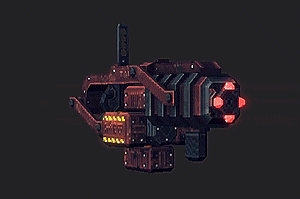 Additionally, all weapons and other items in the game have a unique, handpainted icon that is used within the player’s inventory, with the minelayer looking like this:
 In-game from a first-person view, the end result looks as follows:
[previewyoutube=PLrjeVcs0gY;full][/previewyoutube]
Finally, in addition to all of this, there’s also a number of other things that goes into making a weapon – particle effects, sound design, animation and much more! But in general this should give a good idea of the overall process behind the game’s art.
In-game from a first-person view, the end result looks as follows:
[previewyoutube=PLrjeVcs0gY;full][/previewyoutube]
Finally, in addition to all of this, there’s also a number of other things that goes into making a weapon – particle effects, sound design, animation and much more! But in general this should give a good idea of the overall process behind the game’s art.
User Interface
One often forgotten aspect of a game’s visual expression is its UI art and design. I will be talking about this more in a separate dev blog post, since the topic very much deserves its own spotlight! That being said, to sum this up shortly – usually game UIs lie somewhere on a spectrum between abstraction and skeuomorphism. Minimalist, abstract UIs have the benefit of getting out of the player’s way and highlight the rest of the game, which works very well in many cases. On the flip side, more skeuomorphic UIs can work as a wonderful way to further inject a sense of atmosphere and immersion into a game – something such as say, the Fallout 1/2 UIs are a great example of this.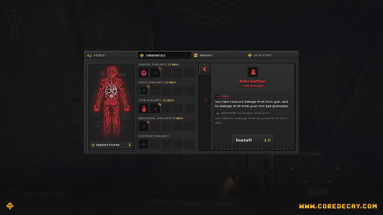 Core Decay lies somewhere in the middle of this spectrum – its UI is not fully skeuomorphic in that it does not attempt to emulate any particular real-world material nor does it present itself in the actual game world. On the other hand it is not entirely abstract either, with its visual language evoking the same style of interface also present in in-game terminals or other locations. Hopefully the end result is a UI that feels atmospheric while still being clear and highly usable!
