The new Saint Kotar cover
Take a good, good look at it: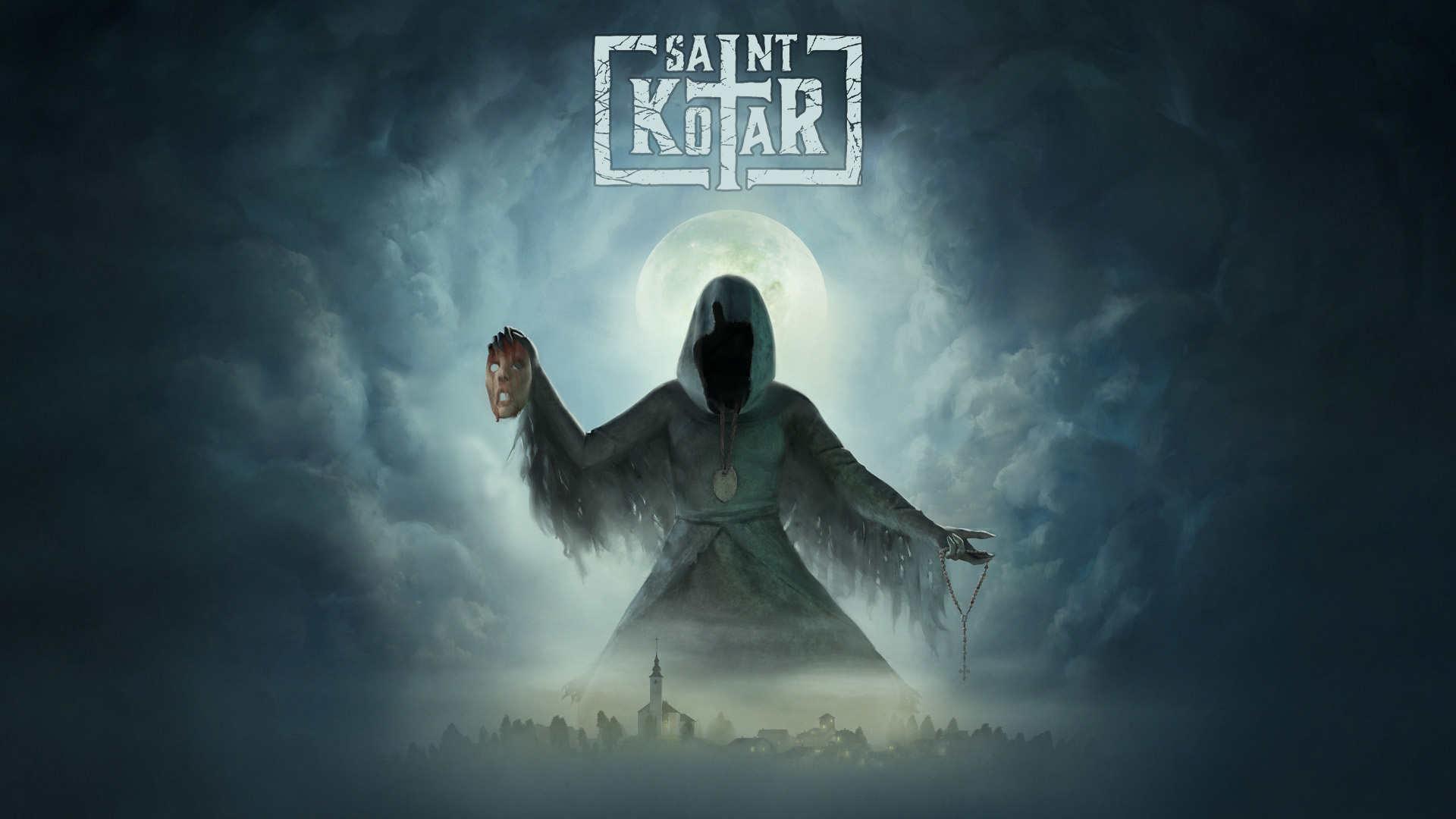 Have you noticed? We slightly changed the logo as well. Now, you might wonder, why the new cover? Long story short, we believe the new one better represents the game and is more visually appealing than the old one. The new cover is [b]darker, more story-aligned and full of hidden symbolism[/b]. Nothing was added on the cover for the sake of making it look nicer, every single element and detail are there for a reason.
Some behind the scenes of the creation process:
[previewyoutube=xOFEWxGiSDI;full][/previewyoutube]
Have you noticed? We slightly changed the logo as well. Now, you might wonder, why the new cover? Long story short, we believe the new one better represents the game and is more visually appealing than the old one. The new cover is [b]darker, more story-aligned and full of hidden symbolism[/b]. Nothing was added on the cover for the sake of making it look nicer, every single element and detail are there for a reason.
Some behind the scenes of the creation process:
[previewyoutube=xOFEWxGiSDI;full][/previewyoutube]
UI changes
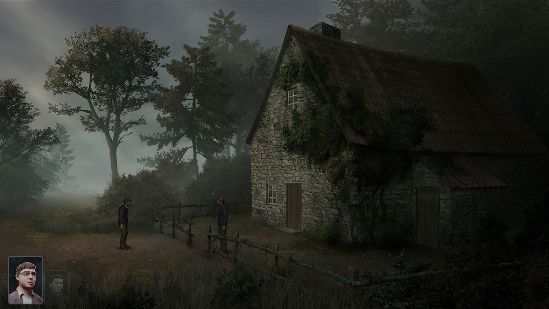
Aside the technical overhaul and improvements on other important stuff (such as, the smoothness and speed of animations), we've also started redesigning the user interface. Still a work in progress, but this is close to how the new dialog options box will look like in Saint Kotar: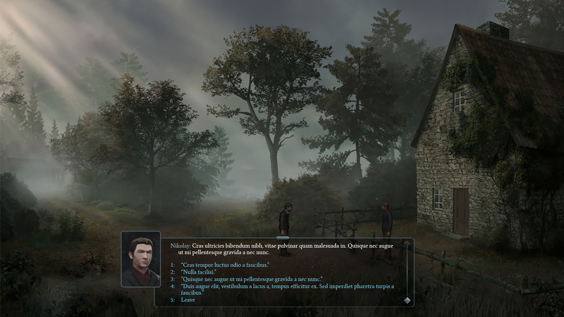 And, still regarding the UI changes, portraits are replacing the inventory icon in the bottom-left corner: