
 Happy spooky month everybody :)
As fall descends upon us and I'm eating strange mushrooms found in the forest, we're still hard at work on [i]Slay the Spire 2[/i]. This month, let's touch on the art direction and how we're planning on changing things up when working on our sequel. But first, a brief progress update.
Happy spooky month everybody :)
As fall descends upon us and I'm eating strange mushrooms found in the forest, we're still hard at work on [i]Slay the Spire 2[/i]. This month, let's touch on the art direction and how we're planning on changing things up when working on our sequel. But first, a brief progress update.
Slay the Spire 2 Dev Update
September was a festive month as some of us got together to meet in Seattle, WA during PAX West. However, this meant that everyone got COVID so I'm not sure if that was worth it. Three of us work out of an office and we're moving offices. Only a mile away, but a move is a move. Besides those drawbacks, we're still focused on getting core content into the game. Content like [b]REDACTED[/b] and also [b]REDACTED[/b]. There have also been significant changes to [b]REDACTED[/b]. Interestingly enough, we implemented in-game patch notes so you'll be able to visit the archive of changes one day! All of our secrets and development pacing will be revealed. Now that a lot of the tools for our trailer editor is complete, there's clean up happening for our core VFX.On Aesthetics Driving Game Design
Last month we discussed why we're working on a sequel instead of adding on to [i]Slay the Spire 1[/i] and this week we're diving into the visual changes we're bringing in! While we hinted at this topic briefly in the past Neowsletter, let's look into what the problems were with the visual style. The first and most important one was that I'm (Casey) bad at art. Now, being bad at art doesn't necessarily mean bad at drawing or having poor taste. It's that I haven't spent enough time in my life to cleanly translate what I'm imagining onto paper. It's a frustrating experience trying to capture a “damned knight powered by demonic energy” as a sprite in a video game. In the end, I gave up on the Ironclad. That's correct–the Ironclad you see today in [i]Slay the Spire 1[/i] is a character I gave up working on. [i]Various ideas, poses, concepts, etc. Plus a bonus resting Ironclad shot![/i]
After 3 - 4 weeks total of on and off ideating, drawing, redrawing, sketching, etc. I drew a character in a pose that I liked thinking it would give me better ideas. Those with a keen eye probably realized that the Ironclad has the same pose as Hakumen from the [i]BlazBlue[/i] series. I found this character with a long thin blade with weighty attacks so cool (he's my main)! On top of this, the faceless nature of the character and this posture was really menacing. I sketched out a character that felt like it would fit in the world of [i]Slay the Spire[/i] in this same pose. It was supposed to be a “This is the feeling I want! Hopefully an artist redraws this later.” but ended up being the final sprite so it felt a little unoriginal due to the pose :(. Still, I'm happy with the outfit and color scheme.
After I had a character with the right feel, now I had to animate it as well? This was daunting, as there was a lot of other work to do (like programming). Already frustrated with how much time was spent on the Ironclad, I decided he can just elbow strike the enemy.
[i]Various ideas, poses, concepts, etc. Plus a bonus resting Ironclad shot![/i]
After 3 - 4 weeks total of on and off ideating, drawing, redrawing, sketching, etc. I drew a character in a pose that I liked thinking it would give me better ideas. Those with a keen eye probably realized that the Ironclad has the same pose as Hakumen from the [i]BlazBlue[/i] series. I found this character with a long thin blade with weighty attacks so cool (he's my main)! On top of this, the faceless nature of the character and this posture was really menacing. I sketched out a character that felt like it would fit in the world of [i]Slay the Spire[/i] in this same pose. It was supposed to be a “This is the feeling I want! Hopefully an artist redraws this later.” but ended up being the final sprite so it felt a little unoriginal due to the pose :(. Still, I'm happy with the outfit and color scheme.
After I had a character with the right feel, now I had to animate it as well? This was daunting, as there was a lot of other work to do (like programming). Already frustrated with how much time was spent on the Ironclad, I decided he can just elbow strike the enemy.
 [i]In the end I didn't use this sprite. The irony...[/i]
The Silent's concept came to me much quicker. But it still took a long time to draw the sprites that exist for her and animating what I drew was also out of the question for my technical ability. A scary skeleton donning assassin. If you can see anything but her cape, it's probably because you've been assassinated. Very cool concept. Great job, Casey. Now give her a wobbly knife because wobbly knives are scary (Kris Dagger).
[i]In the end I didn't use this sprite. The irony...[/i]
The Silent's concept came to me much quicker. But it still took a long time to draw the sprites that exist for her and animating what I drew was also out of the question for my technical ability. A scary skeleton donning assassin. If you can see anything but her cape, it's probably because you've been assassinated. Very cool concept. Great job, Casey. Now give her a wobbly knife because wobbly knives are scary (Kris Dagger).
 [i]The little purple knife was a placeholder. Also, the pose makes no sense.[/i]
A lot of the art for the Ironclad, Silent, and other humanoid enemies didn't read well to a lot of people due to the size of the sprites on screen and my lack of experience here. There were misunderstandings on what a character was doing. How they were standing. How they are holding something. Whether they were supposed to look happy or angry even.
After all of this, I ended up drawing considerably less humanoid characters into the game. This in turn made me incorporate less narrative mechanics. A lot of intrigue and power struggles tend to occur between humanoid races for a reason; we're able to relate more to things that are human than the foreign or abstract. You can see remnants of this from the existence of other humanoid adventurers, slavers, thieves, and so forth! As the game's fun was found in the deckbuilding and core game loop, this felt like an opportunity to reduce the game's scope and rescind a lot of the narrative and story elements which were loosely planned. Today, I ask myself, “But what if those limitations were gone? Hmm...”
[i]The little purple knife was a placeholder. Also, the pose makes no sense.[/i]
A lot of the art for the Ironclad, Silent, and other humanoid enemies didn't read well to a lot of people due to the size of the sprites on screen and my lack of experience here. There were misunderstandings on what a character was doing. How they were standing. How they are holding something. Whether they were supposed to look happy or angry even.
After all of this, I ended up drawing considerably less humanoid characters into the game. This in turn made me incorporate less narrative mechanics. A lot of intrigue and power struggles tend to occur between humanoid races for a reason; we're able to relate more to things that are human than the foreign or abstract. You can see remnants of this from the existence of other humanoid adventurers, slavers, thieves, and so forth! As the game's fun was found in the deckbuilding and core game loop, this felt like an opportunity to reduce the game's scope and rescind a lot of the narrative and story elements which were loosely planned. Today, I ask myself, “But what if those limitations were gone? Hmm...”
Marlowe Dobbe x Mega Crit
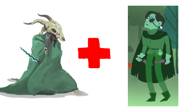 [i]A visual representation of Mega Crit and Marlowe Dobbe coming together, featuring The Silent from Slay the Spire and The Thief from Dicey Dungeons, which Marlowe was the artist for.[/i]
While a lot of my time post-release and during the pandemic was spent on improving my artistic abilities, learning bass guitar, and making various game prototypes in Unity, I also knew there would be too much work for me to be the primary on all things visual if we were to do a sequel. I wanted an “Art Person” who could draw small things that were clear and concise while also inviting playfulness, creativity, and expressiveness. I emailed a bunch of industry friends to see if they knew anybody interested in such a job and we talked a great deal (is this an interview?) and brought her onboard as Art Director. Welcome, Marlowe (3 years ago that is)!
We've been working together for the majority of the project and we continue to hone the visual identity of [i]Slay the Spire 2[/i] based on what I think, what Marlowe thinks, what the rest of our team thinks, and what our internal playtesters think. There's a lot of thinking overall.
Our style and philosophy is merging together and I'm always pushing for UX snappiness and speed while ensuring that the game's vibes don't stray from the original. On top of this, we've also hired a full-time animator, Chris Gortz, and [i]Slay the Spire 1's[/i] card and event illustrator, Anailis Dorta (see our full team here: https://megacrit.com/about/). Working together for a long time allows us to mind meld and I think the harmony you'll see in the game is a sight to behold!
[i]A visual representation of Mega Crit and Marlowe Dobbe coming together, featuring The Silent from Slay the Spire and The Thief from Dicey Dungeons, which Marlowe was the artist for.[/i]
While a lot of my time post-release and during the pandemic was spent on improving my artistic abilities, learning bass guitar, and making various game prototypes in Unity, I also knew there would be too much work for me to be the primary on all things visual if we were to do a sequel. I wanted an “Art Person” who could draw small things that were clear and concise while also inviting playfulness, creativity, and expressiveness. I emailed a bunch of industry friends to see if they knew anybody interested in such a job and we talked a great deal (is this an interview?) and brought her onboard as Art Director. Welcome, Marlowe (3 years ago that is)!
We've been working together for the majority of the project and we continue to hone the visual identity of [i]Slay the Spire 2[/i] based on what I think, what Marlowe thinks, what the rest of our team thinks, and what our internal playtesters think. There's a lot of thinking overall.
Our style and philosophy is merging together and I'm always pushing for UX snappiness and speed while ensuring that the game's vibes don't stray from the original. On top of this, we've also hired a full-time animator, Chris Gortz, and [i]Slay the Spire 1's[/i] card and event illustrator, Anailis Dorta (see our full team here: https://megacrit.com/about/). Working together for a long time allows us to mind meld and I think the harmony you'll see in the game is a sight to behold!

Changes
If I were forced to make a bulleted list of high level changes, it would look something like this:- [b]Playful:[/b]While we still retain some dark themes, the tone is more playful through its visual language and world.
- [b]Crisp:[/b]Creatures, items, cards, backgrounds are all a bit more crisp, as the style is less painterly.
- [b]Liveliness:[/b]Considerably more animations and transitions make the game feel livelier.
- [b]Cinematic:[/b]More whole-screen art stuff. Compared to before, this makes the game feel more epic rather than intimate.
- [b]Colorfuler:[/b]Everything is more colorful! This improves the legibility of various screens as well.
Some words from our Art Director
Working on developing the visual style for Slay the Spire 2 has been a really interesting and unique challenge that I’m unsure I’ll ever get to experience again as a game developer. Coming into work on a sequel of a very beloved game has a whole new set of rules from working on a new concept or property. While we want to update the visuals and make it feel new and fresh, we also want to ride that line of it being recognizable as the Slay the Spire world. [i]Some early explorations for The Silent for StS2. Perhaps there is a universe in which we ended up going in this more cartoony direction.[/i]
Myself and the art team have done what I can only describe as visually dissecting what parts made up the vibe of [i]Slay the Spire 1[/i]. What motifs, repeating visuals, creatures, races, architecture, etc. all add up to the unique, kind-of-creepy-but-kind-of-fun energy of the first game. We’re all big fans of the first installment and I at least have spent an embarrassing amount of my time playing it. When I’m approaching it as a fan and also someone in charge of steering the visuals of the sequel, you start to pick up on things like “yeah there’s not a lot of uncovered faces in [i]Slay the Spire 1[/i], this character we’re working on wouldn’t fit cause you see too much of their face.” or “This is a cool monster, but is it WEIRD enough?” (I have spent a lot of time iterating on enemy designs to make them weirder.)
In the end, our goal is to make it feel bigger than the first game with new sets, new characters and enemies, more full-screen-art, way more animation, and a LOT of VFX (insert sparkles and fire and sparks here.) Of course it’ll look different and new, but I think it’s going to be a place that old and new StS players will feel comfortable and familiar in!
And in the ~spirit~ of the season, here’s a spooky StS2 sneak peek…
[i]Some early explorations for The Silent for StS2. Perhaps there is a universe in which we ended up going in this more cartoony direction.[/i]
Myself and the art team have done what I can only describe as visually dissecting what parts made up the vibe of [i]Slay the Spire 1[/i]. What motifs, repeating visuals, creatures, races, architecture, etc. all add up to the unique, kind-of-creepy-but-kind-of-fun energy of the first game. We’re all big fans of the first installment and I at least have spent an embarrassing amount of my time playing it. When I’m approaching it as a fan and also someone in charge of steering the visuals of the sequel, you start to pick up on things like “yeah there’s not a lot of uncovered faces in [i]Slay the Spire 1[/i], this character we’re working on wouldn’t fit cause you see too much of their face.” or “This is a cool monster, but is it WEIRD enough?” (I have spent a lot of time iterating on enemy designs to make them weirder.)
In the end, our goal is to make it feel bigger than the first game with new sets, new characters and enemies, more full-screen-art, way more animation, and a LOT of VFX (insert sparkles and fire and sparks here.) Of course it’ll look different and new, but I think it’s going to be a place that old and new StS players will feel comfortable and familiar in!
And in the ~spirit~ of the season, here’s a spooky StS2 sneak peek…
 [i]oooOooOoo it’s a new, ghostly, knight-looking enemy…[/i]
Translating the Neowsletter
As we've started posting the Neowsletter on Steam, our viewership has increased significantly. It may be time to start translating these announcements... If you have worked on Slay the Spire translations in the past and/or interested in translating announcements, please contact devs@megacrit.com or DM me on Discord @caseyyano. As an FYI: We're not yet starting on STS2 translations.Mega Crit-or-Treat Returns!
 [i]Our art director Marlowe’s own beautiful Cultist-themed pumpkin carving from last Halloween.[/i]
........BOO!!! Hey, it’s Demi the Community Manager now–did I scare ya?! In any case, it's spooky season again, and you (might) know what that means: Mega Crit-or-Treat is back from the dead!
For those who don't know, last year we held the first annual Mega Crit-or-Treat event, where the community was encouraged to share any Halloween-themed Slay the Spire content, be it drawn, written, modded, cosplayed, cooked, carved, crocheted, interpretively danced, whatever! And this year we're doing it all again, this time with a new prize for participants!
From now until Sunday, November 3, post your beautiful and/or terrifying creations in our [url=https://discord.gg/slaythespire]Discord server[/url] and we will bestow upon you a treat: the limited time Creepy Cultist role!
If you want to join in on the frightening festivities but don't know where to begin, check out these [url=https://bit.ly/45BYgSu]official StS pumpkin carving stencils[/url] made by our art director (and honorary Mayor of Halloween) Marlowe!
Also, if you post any spooky Spire content on Twitter or Bluesky, be sure to spread the eerie cheer by tagging us @MegaCrit!
[i]Our art director Marlowe’s own beautiful Cultist-themed pumpkin carving from last Halloween.[/i]
........BOO!!! Hey, it’s Demi the Community Manager now–did I scare ya?! In any case, it's spooky season again, and you (might) know what that means: Mega Crit-or-Treat is back from the dead!
For those who don't know, last year we held the first annual Mega Crit-or-Treat event, where the community was encouraged to share any Halloween-themed Slay the Spire content, be it drawn, written, modded, cosplayed, cooked, carved, crocheted, interpretively danced, whatever! And this year we're doing it all again, this time with a new prize for participants!
From now until Sunday, November 3, post your beautiful and/or terrifying creations in our [url=https://discord.gg/slaythespire]Discord server[/url] and we will bestow upon you a treat: the limited time Creepy Cultist role!
If you want to join in on the frightening festivities but don't know where to begin, check out these [url=https://bit.ly/45BYgSu]official StS pumpkin carving stencils[/url] made by our art director (and honorary Mayor of Halloween) Marlowe!
Also, if you post any spooky Spire content on Twitter or Bluesky, be sure to spread the eerie cheer by tagging us @MegaCrit!
Slay the Spire Connections
 Since so many of you enjoyed the last one, we’ve got another [url=https://custom-connections-game.vercel.app/x6yButnTBj2l4AUVPwWw]official unofficial Slay the Spire Connections puzzle[/url] this month! Having a regular puzzle section almost makes this feel like a real publication, huh?
This one may be slightly easier but, hey, it’s also slightly spookier too so it balances out maybe.
Since so many of you enjoyed the last one, we’ve got another [url=https://custom-connections-game.vercel.app/x6yButnTBj2l4AUVPwWw]official unofficial Slay the Spire Connections puzzle[/url] this month! Having a regular puzzle section almost makes this feel like a real publication, huh?
This one may be slightly easier but, hey, it’s also slightly spookier too so it balances out maybe.
Community Roundup
And, as always, let’s close this out with some of our community’s wonderful creations from the past month: [i]A beautifully composed poster of the Spire’s many inhabitants by [url=https://x.com/h0lysarthole]@h0lysarthole[/url][/i]
 [i]A big, beautiful, beefy Demon Form Ironclad by [url=https://x.com/ultimatept0812]@ultimatept0812[/url][/i]
[previewyoutube=vZXxf5jXY7E;full][/previewyoutube]
[i]A hilariously animated and insanely catchy song by [url=https://www.youtube.com/watch?v=vZXxf5jXY7E]Finger Pickin Good[/url][/i]
Wow, you made it to the end of this month’s Neowsletter! See you in the next issue, Slayers!
[i]A big, beautiful, beefy Demon Form Ironclad by [url=https://x.com/ultimatept0812]@ultimatept0812[/url][/i]
[previewyoutube=vZXxf5jXY7E;full][/previewyoutube]
[i]A hilariously animated and insanely catchy song by [url=https://www.youtube.com/watch?v=vZXxf5jXY7E]Finger Pickin Good[/url][/i]
Wow, you made it to the end of this month’s Neowsletter! See you in the next issue, Slayers!