
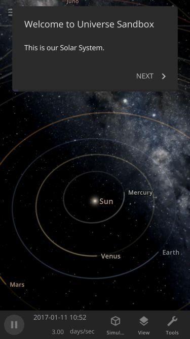 [i]Making our user interface work in portrait mode is an added challenge when adapting it for small screens.[/i]
Pocket-Sized Complexities
We’ve been thinking about Universe Sandbox mobile for a long time and have been developing our panels and buttons to be easy to view and use on small screens for years. In fact, Universe Sandbox mobile is built from the exact same code as the version you already know and love, so it will have the same features and user interface as the desktop experience. This shared codebase means you can enjoy any new features or improvements we add to Universe Sandbox on any device, whether you’re on a desktop, laptop, VR headset, phone, or tablet. While these are seemingly simple goals, they create complex design challenges, including- How to automatically arrange panels and adjust your view so you can focus on controlling the simulation, not having to manage the user interface
- Switching between multiple panels, like an object's properties, data views, and guide instructions, on small screens in landscape and portrait modes
- Overhauling our simulation tools (like explode, laser, and planetscaping), to adapt to all screen sizes
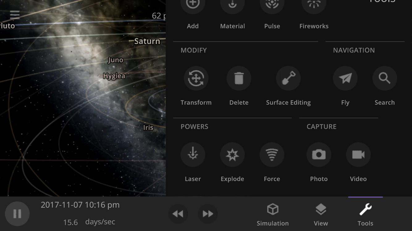 [i]Dynamically resizing panels (this tool panel is cut off) and automatically moving the center of your view so you can always see what you're looking at (moving the Sun hidden behind the tool panel to the empty space on the left) is just one example of the user interface work we still need to do. This is a work in progress.[/i]
Under New (Layout) Management
While most other simulators and games have a different user interface for their mobile and desktop versions, we want ours to use the exact same interface for all platforms. We think we’re among the first to do this, but if you know of another or have done this with your game, please let us know! You can see what Universe Sandbox mobile might look like right now (including why we haven’t released it yet) by resizing the Universe Sandbox window on your computer to the size of your phone (since our user interface dynamically responds to your window size). [previewyoutube=cy-BarkDDYY;full][/previewyoutube] [previewyoutube=DU9wOYVVNGk;full][/previewyoutube] [i]Showing multiple panels simultaneously in both landscape and portrait orientations while still seeing the simulation on a small screen is one of the biggest challenges of mobile development. This is a work in progress.[/i] While we are still making performance improvements so Universe Sandbox can run smoothly on phones, our primary obstacle in mobile development is ensuring our interface is usable on a small touch screen like a phone. We’ve started tackling it by designing a system to intelligently hide and reveal panels as they open and close, which we’re calling our Dynamic Layout System. While creating this system will take time, it should allow future improvements and new features to work in Universe Sandbox without any extra development, regardless of whether you’re playing on mobile or desktop. That means we’ll have more time to work on new features instead of spending time implementing the same feature in two different ways.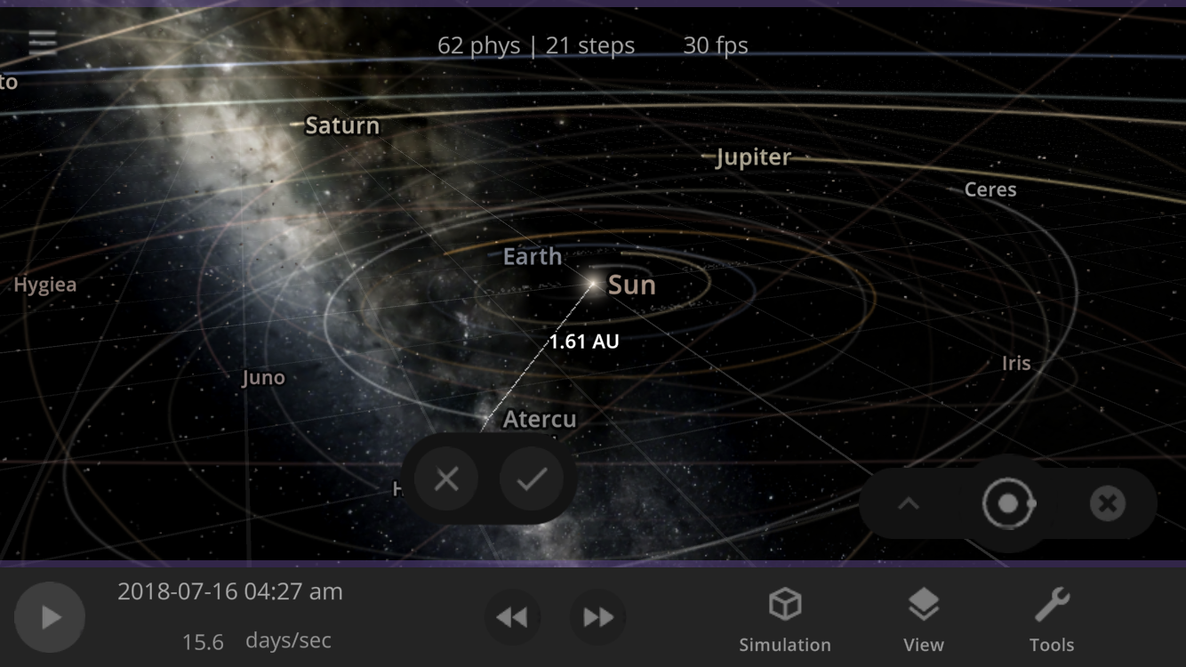 [i]One new design we have is a step to confirm placing an object, helping it end up where you want it. This is a work in progress.[/i]
