
Hey Pioneers,
this is Alex from the [i]Envision Entertainment[/i]-team and I’m one of the artists that work on the many different buildings in Pioneers of Pagonia. Over the last year since Pioneers of Pagonia released into Early Access, we’ve been updating the game not only with brand-new content like the Mining and Magic updates but also with plenty of quality-of-life centered patches. Smooth and comfortable interaction with any system that the players can interact with in Pioneers of Pagonia is very close to our heart, so we’ve been dedicating a lot of time to this so far. Today, I want to shed some light on one of our upcoming quality-of-life updates and give you a glimpse of some of our internal processes and decision-making. In this upcoming patch, we want to tackle the topic of the overall readability of objects in the game and add some much-needed improvements in this area. Pioneers of Pagonia is visually – like most build-up and strategy games – a very busy game. Players can have hundreds of buildings, units, and resources at the same time on their screen and with so much stuff going on it can be difficult to guide the player’s eyes in a way that all available information remains easily recognizable and digestible. As an artist working on this game, it’s also one of my jobs to make sure that everything we add to the game fits into our art style that creates the signature look of Pioneers of Pagonia: charming settlements, picturesque landscapes, and relaxing vibes that invite the players to spend hours upon hours of building up and exploring new islands.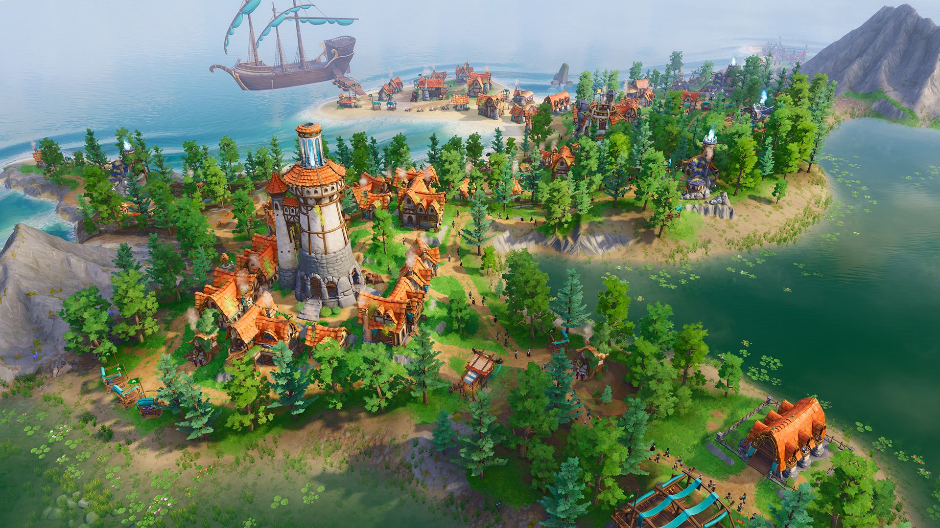 [i]Pagonian Settlement[/i]
We’ve received lots of feedback from players on the buildings, be it online through Discord or the Steam community or live at Gamescom and PAX, and the general opinion seems to be that many players love the game for how it looks, but that it’s also sometimes a bit difficult to identify or find a certain building. Upholding the balance between style and functionality is not always easy. So far, our strategy with designing buildings has been to give each of them a unique shape and silhouette, while keeping individual architectural elements and materials coherent across all buildings.
[i]Pagonian Settlement[/i]
We’ve received lots of feedback from players on the buildings, be it online through Discord or the Steam community or live at Gamescom and PAX, and the general opinion seems to be that many players love the game for how it looks, but that it’s also sometimes a bit difficult to identify or find a certain building. Upholding the balance between style and functionality is not always easy. So far, our strategy with designing buildings has been to give each of them a unique shape and silhouette, while keeping individual architectural elements and materials coherent across all buildings.
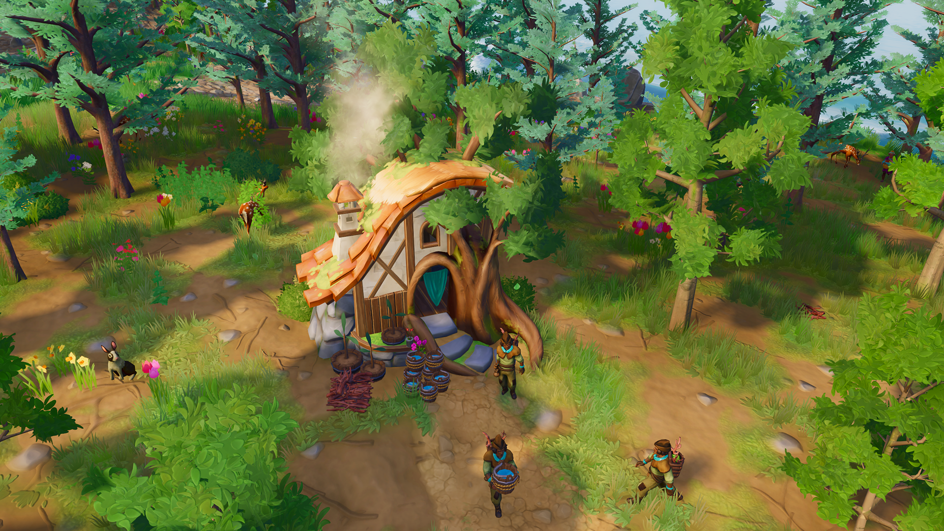 [i]Forester[/i]
We also always add unique elements to each building that might already give a visual hint towards the building's function, while the Forester building features a large tree growing through the walls, the Geologist’s Hut is leaning on a small rocky cliff with visible sediments, for example.
[i]Forester[/i]
We also always add unique elements to each building that might already give a visual hint towards the building's function, while the Forester building features a large tree growing through the walls, the Geologist’s Hut is leaning on a small rocky cliff with visible sediments, for example.
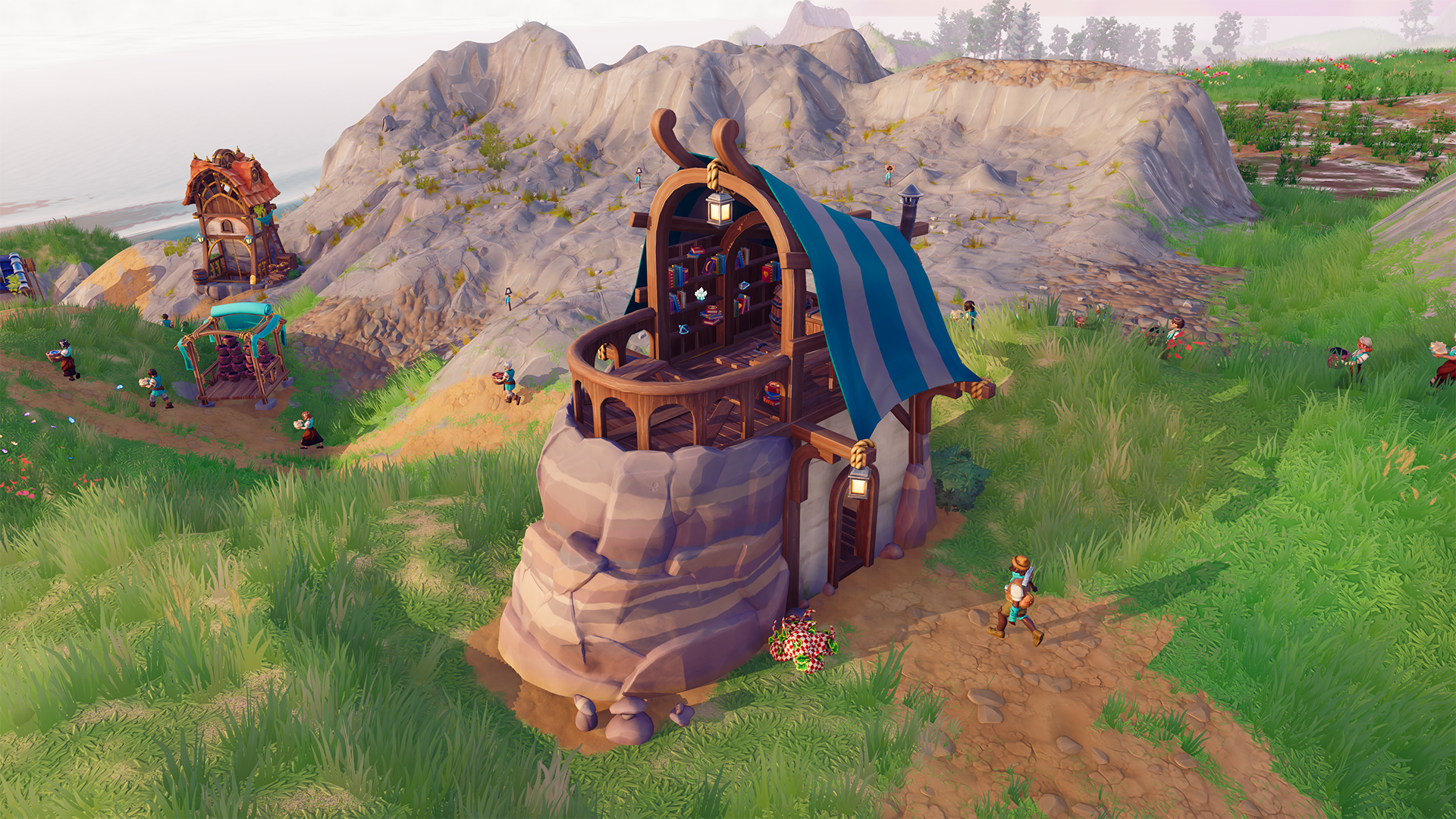 [i]Geologist Hut[/i]
With over 40 different buildings in the game by now, however, you sooner or later run into the problem that some buildings look too similar to another or simply fade into the background once they’re placed in a settlement. Over the last couple of months, I gathered feedback from the community as well as internally from our team on which buildings needed some changes the most, analyzed which problems they caused, and came up with a couple of possible solutions together with the design and art team.
[i]Geologist Hut[/i]
With over 40 different buildings in the game by now, however, you sooner or later run into the problem that some buildings look too similar to another or simply fade into the background once they’re placed in a settlement. Over the last couple of months, I gathered feedback from the community as well as internally from our team on which buildings needed some changes the most, analyzed which problems they caused, and came up with a couple of possible solutions together with the design and art team.
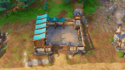
 [i]Town Center before[/i]
The Culprits
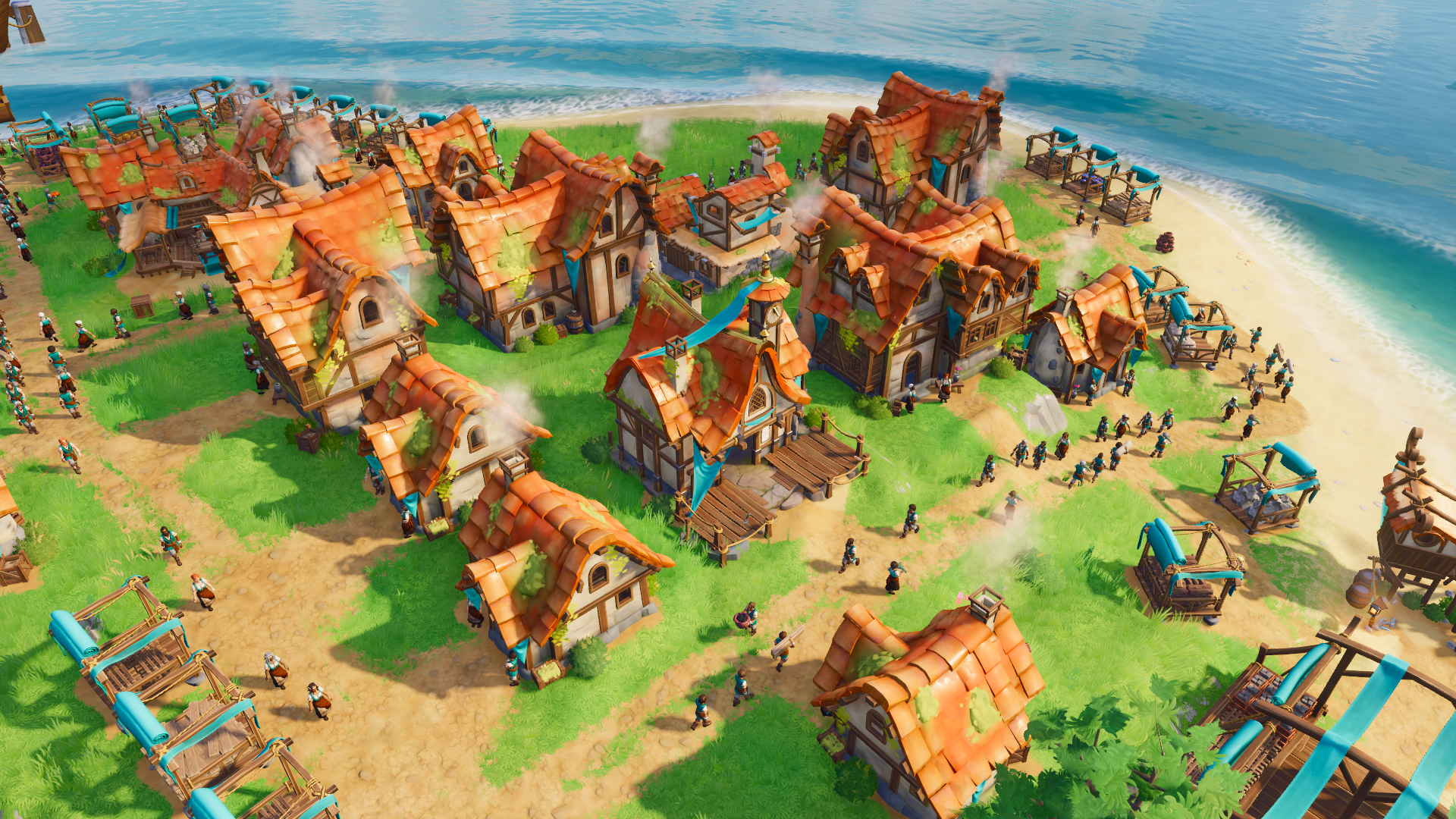
While building a busy settlement core, players often place the [b]Tavern[/b], [b]Guild Hall[/b], and [b]Residence[/b] close to each other. Together, these three buildings create a nice, dense, and almost urban center, but we found that the overall look of the three buildings is a bit too homogenous. They all occupy the same space, have similar heights, layout and materials. The Tavern and the Guild Hall are buildings to which players return quite often, in order to check the meals that they are producing or to manage the recruitment of new workers, so it was essential for us that they needed to stand out a bit more. Although the [b]Wood Workshop[/b] already features some wooden ornaments on its rooftops, it was one of the buildings players struggled to easily identify, they were always looking for that place where they could order more Wooden Cogwheels for their Windmills and Mines but were never able to find it! The [b]Garrison[/b] and [b]Military Academy[/b] are two buildings that have different functions, but both deal with military units, occupy the same space, and have a very similar square-shaped structure.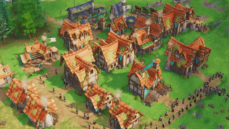 [i]Iteration process of Guild Hall and Wood Workshop[/i]
The Improvements
For the [b]Guild Hall[/b], we decided to increase the space that the building takes up from 3x3 tiles to 4x4 tiles. Players rarely place more than one Guild Hall, so since it’s not a building that is placed often taking up more space would help it stand out more against multiple Residences, without making it considerably more difficult to place. With more space available, the many different tool piles that the building features also aren’t all crammed in front of the hall but distributed more evenly throughout the perimeter. We decided to make the clocktower more of a focus point and swapped out the previous sun clock for a clock with hands and a more recognizable dial face. Additionally, we put the entire building on a foundation to increase its height and make it stand out more. With these new improvements, the Guild Hall catches the eye of the player more easily and is now up to the task of acting as a center point for every Pagonian settlement.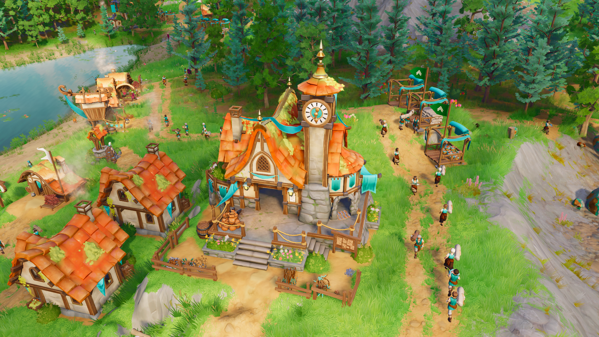 [i]New Guildhall[/i]
 [i]New Guildhall in Town Centre[/i]
For the [b]Wood Workshop[/b], the goal was to give it a unique look and create a stronger visual connection to the actual use of the building, so incorporating more wood into its roof was one of the thoughts that immediately came up. As most of the structural elements of the building besides the roof tiles were already mostly wooden, I was a bit concerned about adding even more of the same wood, hoping to find a way to avoid the entire thing ending up looking like a uniform block made out of wood. I tried out using a different color of wood and applied the colors we use for the hardwood resources to the new wooden shingles, which I thought was a fitting idea, as the Wood Workshop is also one of the only buildings in the game that utilizes hardwood boards. Internal feedback, however, suggested that the light-colored wood clashed too much with the usual wooden tones that we use in the building, making it difficult to discern as a material on its own. Following that feedback, I applied our usual wooden tones to the shingles, added more moss on top to give it more of a “forestry” feel, and exposed more of the plaster and framework on the main structure of the building, breaking up any areas of the building that felt visually too uniform.
[i]New Guildhall in Town Centre[/i]
For the [b]Wood Workshop[/b], the goal was to give it a unique look and create a stronger visual connection to the actual use of the building, so incorporating more wood into its roof was one of the thoughts that immediately came up. As most of the structural elements of the building besides the roof tiles were already mostly wooden, I was a bit concerned about adding even more of the same wood, hoping to find a way to avoid the entire thing ending up looking like a uniform block made out of wood. I tried out using a different color of wood and applied the colors we use for the hardwood resources to the new wooden shingles, which I thought was a fitting idea, as the Wood Workshop is also one of the only buildings in the game that utilizes hardwood boards. Internal feedback, however, suggested that the light-colored wood clashed too much with the usual wooden tones that we use in the building, making it difficult to discern as a material on its own. Following that feedback, I applied our usual wooden tones to the shingles, added more moss on top to give it more of a “forestry” feel, and exposed more of the plaster and framework on the main structure of the building, breaking up any areas of the building that felt visually too uniform.
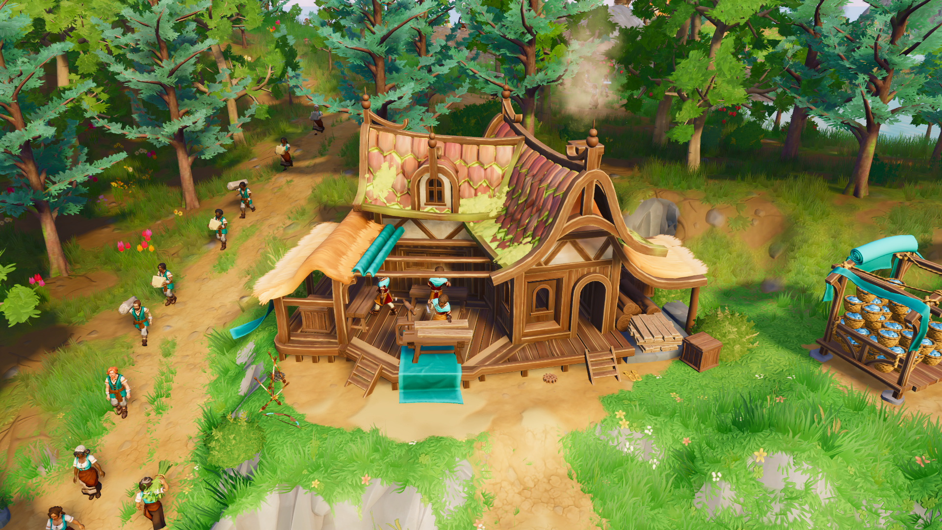 [i]New Wood Workshop[/i]
The goal for the adjustments to the [b]Garrison[/b] and [b]Military Academy[/b] was to double down on what made each of them unique in the first place in order to flesh out their visual identity. The stone foundation that the Military Academy used to sit on was also present in the Garrison and we thought that it fit better to the Garrison, as that building is the thing that is closest to a castle or fort that we have in our roster of Pagonian buildings. We opted for a dirt ground under the Military Academy, which in our eyes fit well together with the idea of a training ground – a place where Pagonians practice with weapons and armor in order to be recruited as soldiers.
[i]New Wood Workshop[/i]
The goal for the adjustments to the [b]Garrison[/b] and [b]Military Academy[/b] was to double down on what made each of them unique in the first place in order to flesh out their visual identity. The stone foundation that the Military Academy used to sit on was also present in the Garrison and we thought that it fit better to the Garrison, as that building is the thing that is closest to a castle or fort that we have in our roster of Pagonian buildings. We opted for a dirt ground under the Military Academy, which in our eyes fit well together with the idea of a training ground – a place where Pagonians practice with weapons and armor in order to be recruited as soldiers.
 [i]Military Academy before and after[/i]
Even just changing the flooring of both buildings helped with the overall readability and we improved it even further by adding more wooden structures to the Military Academy and new banners to the Garrison. Lastly, we also rotated the overall layout of the Military Academy by 90 degrees, which also helped with any visual repetitions when both buildings were placed next to each other, as both buildings’ layouts were quite similar before.
[i]Military Academy before and after[/i]
Even just changing the flooring of both buildings helped with the overall readability and we improved it even further by adding more wooden structures to the Military Academy and new banners to the Garrison. Lastly, we also rotated the overall layout of the Military Academy by 90 degrees, which also helped with any visual repetitions when both buildings were placed next to each other, as both buildings’ layouts were quite similar before.
 [i]Garrison before and after[/i]
These are just a couple of the many improvements we are going to release in our newest Quality of Life patch. There are even more improvements to units, resources, and deposits, as well as many changes to the UI that you guys should keep an eye out for! You can find all of the updates in our detailed [url=https://store.steampowered.com/news/app/2155180/view/693094122829905932?l=english]patch notes[/url] and we’re very excited for your reactions to the new patch and looking forward to everyone’s feedback once again.
From a developer’s perspective, I really want to highlight how amazing it is to work on a game in Early Access like this. We get to iterate on many aspects of the game based on player feedback before the game has even fully released, and it really helps us deliver a high-quality game that not only works for us but also primarily for all the players out there. My thanks go out to everyone who voices their opinion about the game in any possible way, your input is much appreciated and fundamental to make Pioneers of Pagonia as best as it can be.
Thanks for reading and have fun with the new update!
[i]Garrison before and after[/i]
These are just a couple of the many improvements we are going to release in our newest Quality of Life patch. There are even more improvements to units, resources, and deposits, as well as many changes to the UI that you guys should keep an eye out for! You can find all of the updates in our detailed [url=https://store.steampowered.com/news/app/2155180/view/693094122829905932?l=english]patch notes[/url] and we’re very excited for your reactions to the new patch and looking forward to everyone’s feedback once again.
From a developer’s perspective, I really want to highlight how amazing it is to work on a game in Early Access like this. We get to iterate on many aspects of the game based on player feedback before the game has even fully released, and it really helps us deliver a high-quality game that not only works for us but also primarily for all the players out there. My thanks go out to everyone who voices their opinion about the game in any possible way, your input is much appreciated and fundamental to make Pioneers of Pagonia as best as it can be.
Thanks for reading and have fun with the new update!